
Apple's Future Innovations: What to Expect in 2027
Apple is known for its high-quality hardware and polished software.However, the company often sticks to familiar designs and innovations for years. As an inevitable result, truly new products from Apple appear only once or twice a decade. The year 2027 looks promising, with many exciting upgrades on the horizon.A glimpse into Apple's 2027 Plans
Mark Gurman from Bloomberg recently shared insights about apple's roadmap for 2027. It appears that meaningful changes are coming. As a consumer,I find it wise to hold off on buying current models and save up for what’s expected in two years.
The Foldable iPhone: A Long-Awaited Reality
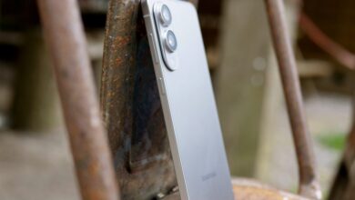
Rumors suggest that Apple will finaly introduce a foldable iPhone in 2027 after much speculation over the years. Even though Apple has been late to this trend, it truly seems worth the wait.
Reports indicate that Apple has nearly eliminated the crease found in foldable displays—a common issue with such devices. While other brands like Oppo have made strides toward reducing this crease, none have entirely solved it yet.
If apple succeeds in addressing this challenge, their foldable iPhone could set new standards for all similar devices. Additionally, Samsung is believed to be supplying advanced display technology for this phone—one that is thinner and offers better brightness and color than typical flexible screens.
This next-generation display may not yet be available on Samsung's own devices but could debut with Apple's offering priced above $2,000.A slimmer design also aligns with Apple's goals of creating lighter models like the upcoming iPhone 17 Air.
Celebrating Two Decades of Innovation: The Anniversary iPhone
The tenth-anniversary model was groundbreaking; it changed how we view smartphone design today.Similarly, the twentieth-anniversary edition expected in 2027 might bring another major shift.
Gurman notes plans for an all-glass curved design without any visible cutouts on its screen—an edge-to-edge look where even features like Face ID would be hidden beneath the display surface.
While other companies have experimented with under-display cameras before—like Samsung and some Chinese brands—the quality has often fallen short due to light passing through multiple layers of pixels before reaching the sensor.
Along with its sleek appearance, there are hints that this anniversary model may also eliminate physical ports entirely—including SIM slots—and utilize one of Apple's own network modems rather. This could mark another significant evolution in smartphone design from Apple.
Smart Glasses: Finally Coming?
Apple's venture into smart glasses has been shrouded in mystery until now. Reports suggest they aim to compete against Meta by launching glasses equipped with cameras but lacking an internal display unit.
These smart glasses will likely feature Visual Intelligence technology powered by AI algorithms designed to interpret surroundings based on camera input.
other tech giants like Google already offer similar capabilities through their products while Meta continues developing enhancements alongside Ray-Ban’s smart glasses collaboration.
Looking ahead further down the line, true augmented reality (AR) glasses are still being developed at Apple but remain some time away from release.
In parallel efforts within wearable tech space include plans for a lighter version of Vision Pro headset aimed at affordability without sacrificing comfort or performance compared previous iterations which required tethering via wired connections back Mac computers during use cases requiring heavy processing power.
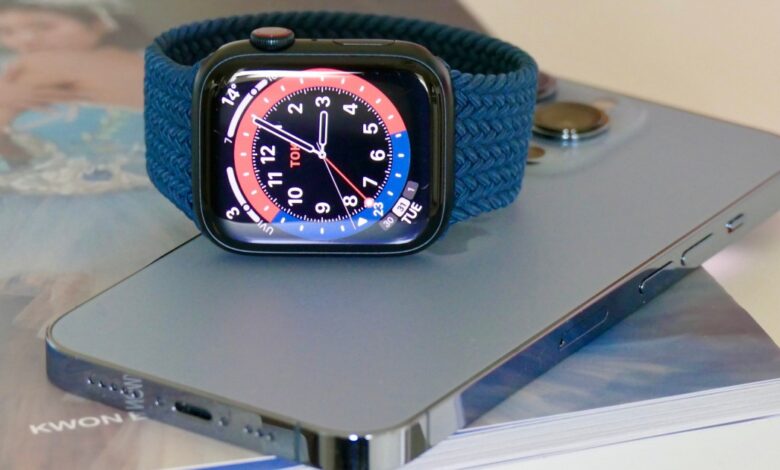
Wearables Get Smarter: Cameras Coming Soon
Apple seems poised to integrate cameras into its wearables as well—specifically targeting both smartwatches and wireless earbuds equipped sensors capable capturing images/videos directly users’ wrists/ears respectively!
Interestingly enough Meta had previously explored similar ideas but ultimately scrapped them during prototyping stages several years ago now leaving room open competition here between these two tech giants moving forward!
For instance mainline versions standard apple watch along pricier ultra variant reportedly feature different placements camera lenses; former integrated within display assembly while latter positioned closer rotating crown side allowing easier access when needed!
Beyond just photography capabilities though these advancements could enhance wellness features including fall detection assistance workouts emergency communication situations arise unexpectedly too!
AirPods might receive comparable upgrades enabling real-time translation services alongside improved AI-driven analysis world around wearer enhancing overall user experience substantially across board!
Recent developments show promise potential applications artificial intelligence headphones translating conversations multiple speakers together driven by powerful M2 silicon chip powering them showcasing innovative possibilities ahead future product lines offered consumers alike!
Overall signs point towards exciting times ahead come year twenty twenty-seven marking return form apple delivering fresh designs remarkable innovations coupled enhanced generative ai stack revamped Siri boasting advanced natural language understanding capabilities topping everything else off nicely!