
Anticipating Changes in Android's Visual Design
Each year, Google introduces a variety of features to Android. However, major visual updates occur less frequently. The last significant redesign happened with Android 12 over three years ago. Now, as we approach the launch of Android 16, Google is expected to unveil another round of visual changes across the user interface (UI). this has sparked new excitement among users, but it may be too late for some.
A Fresh Look for Android
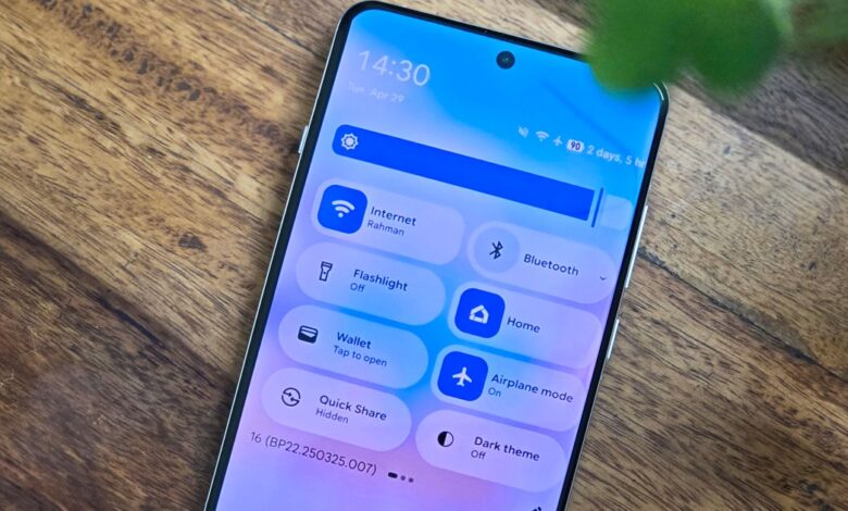
The upcoming redesign promises a vibrant and modern aesthetic. Users can expect brighter colors and updated sliders throughout the interface. Even small details like status bar icons are getting enhancements for better clarity and detail. Many elements will feature a translucent design that gives them a contemporary feel.While these updates are visually appealing, their timing raises questions.
What’s Coming with Android 16?
The official rollout of Android 16 is anticipated during Google I/O on May 20th. This event typically showcases major updates alongside new features for developers and users alike. However, there are indications that not all changes will be available at launch.
These new visual elements were not widely accessible before being discovered by tech enthusiasts at Android Authority in the latest beta version of Android 16. They had to reverse-engineer the code to activate these features themselves, meaning most users testing the beta on Pixel devices won’t see them right away when the stable version launches.
Poor Timing for Major Updates
Typically, significant visual or functional upgrades coincide with new versions of software like Android. Such upgrades deserve dedicated version numbers; anything less feels inadequate! Othre companies also follow this trend—Apple often refreshes its interfaces across various platforms concurrently.
Moreover, it’s common practice for companies to preview upcoming interface changes months ahead through beta programs. This strategy helps consumers adjust to potential shifts while allowing time for feedback and improvements based on user input.
Google usually adopts this approach too; many features are introduced as optional rather then mandatory changes forced upon users without warning—like Adaptive Icons introduced in Android 12 that still need refinement before becoming fully functional.
A Bigger Update Ahead?
This context makes it seem unlikely that these newly discovered features will debut with Android 16 itself; they might rather lay groundwork for more extensive visual updates in future releases like Android 17.
An additional factor supporting this idea is Google's shortened timeline working on this update after starting its developer preview program later than usual last October instead of February as previously done in past years.
This accelerated schedule follows delays experienced during last year's launch cycle with previous versions likeAndroid15 .
The Need For Thorough Testing
Pushing out an incomplete feature without adequate testing or feedback from developers would not reflect well on Google’s standards.
It seems more plausible that any announcements regarding these visuals could come later this year exclusively tied into specific devices such as Pixel10 series models — although historically ,Google hasn’t differentiated between devices based solely upon appearance alone .
The Uncertainty Continues
While introducing such drastic changes soon appears unlikely ,there remain reasons why expectations could shift unexpectedly .
As an example ,Google continues developing its third iteration within Material Design theme engine known internally under “Expressive” branding which aims towards enhancing overall aesthetics further down line .
This concept might potentially be presented at I/O conference encouraging developers adopt similar styles into their applications unlike Apple who enforces strict guidelines regarding app appearances making adoption slower among third parties compared against what happens within ecosystem controlled by google itself.
If successful implementation occurs quickly enough then perhaps we’ll see some aspects integrated sooner rather than later either via optional themes rolled out alongside other announcements made during events leading up towards launches planned throughout remainder year ahead !
A long-Awaited Redesign
No matter how rollout unfolds ,the proposed interface looks sleek & desirable! it’s frustrating how long it took get here compared competitors offering fresher designs already available today !
This change would help bring stock android closer parity iOS along brands Samsung,Xiaomi & OnePlus who’ve embraced similar trends featuring translucent backgrounds simpler icons enhancing overall experiance greatly ! Waiting feels unbearable sometimes …
(On positive note though stretching release allows ample prospect refine test thoroughly enabling third party devs integrate comparable functionalities )!
I just hope nothing else gets left behind unfinished limbo state seen previously Adaptive Icons Desktop mode etc…